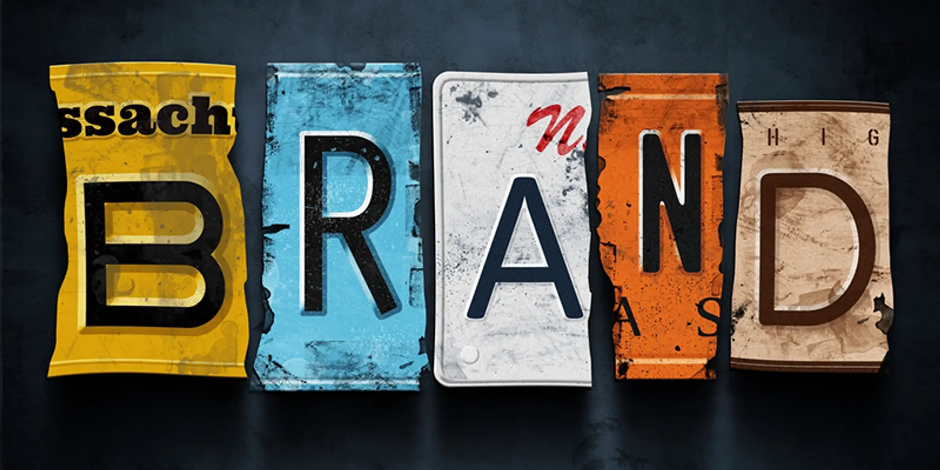
What if famous brands had regular fonts? Meet RegulaBrands!
Last week, I was on a Skype call with a friend in Italy, who also happens to be a designer. Like every other time, we took the discussion to one of our favourite topics — ‘clients.

Call it coincidence, fate or a mutual observation, we have both been asked the same question by our clients time and again. They may pop up as suggestions or doubts. And at times, they are more of a threat!
The common ones are, “all my office computers have Arial. Let’s use it for our logo.”
“I thought logos are always in Times New Roman.”
“My daughter loves Comic Sans!”
To sum up all the versions of this typical query and deliver it into a simple sentence, it would be, “Why can’t we use a regular font for our logo?”
Typically, a brand identity or logo project gets stuck at a ‘font’ intervention, where some members of the client’s team are unsure of how a unique font/typeface approach is better than a ‘regular font’ approach. Their apprehension is valid and reasonable.
This is where I decided to do a simple exercise to recreate famous brands using regular fonts, to “RegulaBrands”. The intent is to evaluate whether regular fonts are acceptable or do we need customised, unique versions of fonts for better brand identities and logos.
Please be honest and look at these eight recreated brands. It will be exciting to share your thoughts and have a discussion on this exercise.
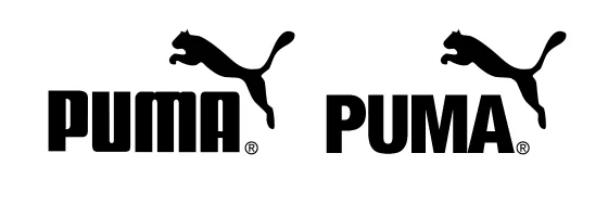
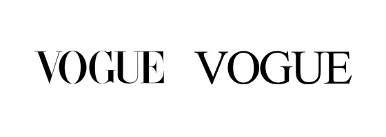
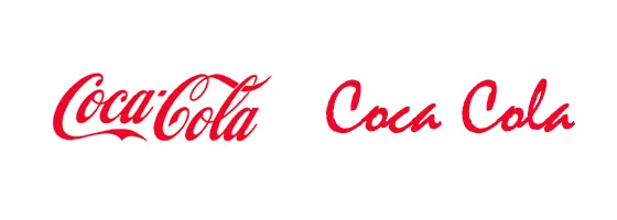

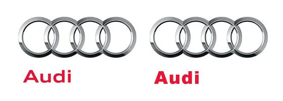

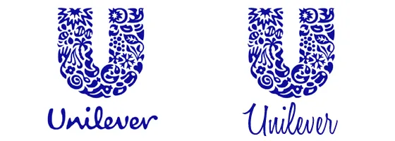
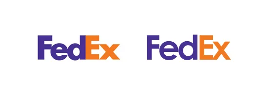
Do RegulaBrands work better than the original brands?
The notion of a brand identity or in common parlance, a logo, is to:
1. Create a unique personality that defines what attributes a brand stands for
2. Define a unique visual imagery that’s easily recognisable by one’s sub-conscious
Of course, there is a lot more that goes into creating highly functional and memorable brand identities. The two above form a great framework to review an identity, and improve the possibility of how the identity or logo, is perceived by the consumers.
A technical implication that we as designers tend to miss at times, is of type or font licences. It’s essential to secure a licence for the brand that’s using the font, and make sure it’s mentioned in the brand guidelines.
While several fonts are available free of cost, a few great resources to find unique, both paid and free, fonts are Font Squirrel, DaFont, Font Fabric and Fonts.com.
That said, I wish I could find a brand that would use ‘Comic Sans’ as its RegulaBrand, but no luck so far. Maybe, you could suggest a brand?
Will be looking forward to reading comments, and discussing why don’t type designers choose regular fonts more often.
(Disclaimer: The views and opinions expressed in this article are those of the author and do not necessarily reflect the views of YourStory.)